Thursday, September 21, 2006

Evolution Last? (Read previous posts below FIRST!)

All renerings ©Jasonoah Design Build Jasonoah.com


Here you can see the most recent (and PERHAPS the final) set of elevations. Notice how the barn door idea has been modified by the architects. It's simpler - the double sliding door panels have been reduced to one. (This was partly driven by code: my sliding panel would cover an egress in the "open" position). I like it.

Another important modification: the "tree motif" is back (yea!) You can see it most clearly in the east elevations. This is a much more satisfactory solution than the first version.


On the left is the original "tree", on the right the most recent. Recall the architects' justification for the changes quoted below: "The reason we believe the new approach is more mature is that it lets the building, it's geometry, it's massing, it's material and it's function be more natural- more about itself. " There was something limiting about the first tree. Perhaps it divided the facade just too neatly into two halves. Perhaps it was too...simple? Or maybe it was that it reinforced the traditional geometry of the "barn (or house) shape" just a little too much. The new "tree" is even more abstracted than the original, its asymmetry more pronounced. It also compliments the NEW shape of the barn in a more agreeable way. For me, it just "fits".

Evolution of an Elevation, Pt. IV

All renerings ©Jasonoah Design Build Jasonoah.com

Door position 1


Door Position 2

The most prominent feature of the last set of elevations is that triangular slab of barn board that juts out just over the entry stairs. I refer to this as "the wing." The following is from an email I sent to the architects late last week:

"I wanted to share with you an idea I had...I like the way "the wing" creates a kind of intimacy of scale just prior to entry into the house...or the stairs, anyway. But it just felt like it kind of "flew" out there in space, almost as if it were going to fly right off the house (or poke a really tall guest in the eye!) Then that strong horizontal of the bottom edge of the wing reminded me of the horizontal track that ran across the side of the original barn along which the barn door slid. So I got to thinking: what if we dropped a sliding panel from the end of the wing, putting it on tracks so it really moved, cut an opening in it as a human-scaled door and left it there, requiring people to enter the house through this door. It's almost as if the traditional barn door had been retained or remembered as a kind of transitional space but in a new location and with a new effect. I think it could heighten the sense of transition and entering as well as provide a nice dramatic "moment" for the guests as they pass through it. In this sense it functions similarly to that wonderful screen you had on the very first set of hand-drawn schematics - the one you had to walk around to approach the stairs."

Much to my surprise, the architects really seemed to latch onto this idea - which I consider an honor and a testament to how open they are to idea-sharing. As you can see, the barn door concept made it into the most recent set of plans.

The Evolution of an Elevation, Pt. III

All renerings ©Jasonoah Design Build Jasonoah.com

Our architect sent us this colored version of the then-most-recent elevations; it's nothing more than a black and white print-out filled in with colored pencil, but what a DIFFERENCE color makes. What you can see nicely here is the coloration of the MDO paneling (more on that later) and the way it's smooth texture contrasts with the roughness of the weathered barn sheathing. I look to these drawings as being an important step (for me) toward embracing these elevations.

I like the height of the west end of the house. Whether or not we will be able to afford the retaining wall remains to be seen, however. Notice how the old barn sheathing has been raised out just a bit from the side of the house and the way this creates an interesting play of light and shadow. Maybe you can see this, maybe not, but these new elevations are less staid than the first ones. The slight asymmetry and shifting of panels sets up almost a sense of movement in the geometry of the design. The "box" has been broken...or set free?

Saturday, September 16, 2006

The Evolution of an Elevation, Pt. II

All renerings ©Jasonoah Design Build Jasonoah.com


(If you haven't read the previous post, do that first.)

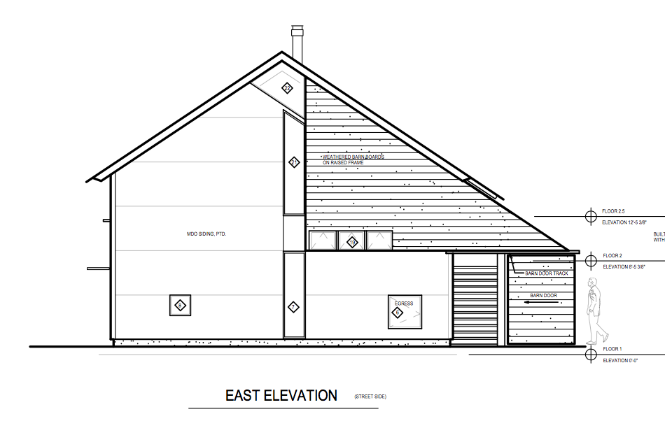
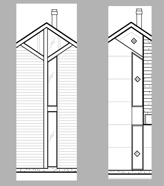
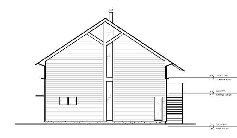
The loss of the "tree motif" and the symmetry of the original elevations on the east and west facades was just TOO far a swing for us. We asked if there could be some "homage" to that initial iteration of the plans. The top image is what came back in response. Here's what the architects had to say about this version:

"Here's another pass at the elevations. There's not huge changes here, but we feel that this direction is ultimately more in keeping with the panel siding. While it is not as "symmetrical" as the original elevations, by removing the random edging of the barn board sections, a traditional house shape is more easily readable and defined...

...On the east elevation, there is a continuous line from one side of the tall window to the edge of the barn siding up to the roof. While not exactly in the center, it helps break up the large plane and alludes to the symmetry of the building.

...We think the "random" play of window sizes and placements fit well with the siding. We've tried to fit the windows to edges or corners of the siding panels to even accentuate the panel pattern rather then denying or hiding them. This will help keep the facades orderly and less random."

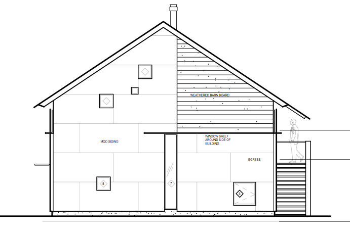
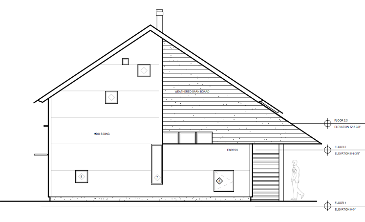
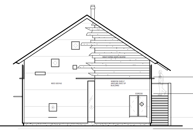
The bottom elevation came in just yesterday. Here are the comments:

"We have tried to incorporate your...concerns about order and symmetry while developing this new and what we believe is better and more timeless approach to the issue...The original elevation layout was fine and good, though we think that it was more of a matter of trying to use geometry for visual purposes as well as trying to disguise both the large, massive shape of the building as well as those huge sliding doors. I now see it more clearly that what we sort of ended up with was more of a curious blend of forms and masses (curious vs. beautiful?). The reason we believe the new approach is more mature is that it lets the building, it's geometry, it's massing, it's material and it's function be more natural- more about itself. Designing a "facade" is always difficult and dangerous, and by keeping things more simple and functional, you'll always end up with a more timeless result. Just the same, there is sort of an inherent facade element to a project like this, so the less curiosity and more beauty the better...

...On the east elevation, we have taken the barn board element to its logical next step. Since the barn board element is really like an applied panel on the facade, we've celebrated and extended it to both break the confinement of the barn shape and create a more dramatic procession to the entry. The panel "slides" out over the entry to the stairs like a modern gateway, or portico without columns (would that be called a nonastyle?) This could take other forms if the pointed end is too severe - though I think the simple drama is in keeping with the simplicity of the barn shape itself. Again, this is not there to just be a funky visual thing (though I believe it's important to create something interesting on the public or street side of the house), but mostly as an experiential element as you approach, pass through this implied threshold, and into the private zone of the entry, and again upon leaving the house. By having this gateway a part of the building itself, you don't need to create it in the landscape-though let me be clear that you now have a cool opportunity to play off this in the landscape as you live with the house over the years."

I have to say that one of the reasons this process has been so satisfying for me is that it has been an intellectual as well as an aesthetic challenge. As an art historian I am as fond of art theory as art itself - this process has been an opportunity to "think deeply" about the space that we will call home. Having said that, I am aware of the fact that my spouse doesn't interact with architecture on this theoretical level with the same glee as do I, and as the architects wrote, "it's one thing to intellectualize this whole thing, but it's another to be able to visualize and embrace it from a purely aesthetic sense." It is not an option that my wife live in a house with which she doesn't feel fully comfortable. (Same goes for me!) And so the process continues! Do YOU have an open mind? How far would you be willing to let the process go before stepping in and saying, "enough is enough"? Can you live with the uncertainty that comes with this stage of the game?

The Evolution of an Elevation, Pt. I

All renerings ©Jasonoah Design Build Jasonoah.com


Every time I receive an email from our architects that has a little paper-clip icon next to the subject line (which always indicates drawings are attached) I get palpatations - the good kind. The email I received 09.08.06 was no exception. As my eye moved across the screen I saw the sender's name, I saw the paper-clip, and then I saw the subject line: "RE: Some major revisions- free your mind." My heart really started thumping.

If you have been reading this blog for the past few months you, like us, have grown accustomed to the elevations that have been on the table since April. When we opend the email and saw the revisions, we were taken aback. Gone was much of what we had grown attached to: the soaring, vertical band of windows that "bloomed" just under the eaves into the two triangular windows; gone was the overall sense of symmetry and order to the facade, and in its place was the image that you see second from the top.

We hired architects for a reason, and that reason was NOT about a desire to simply pay someone to turn OUR pre-determined vision into a reality. We hired architects, who are artists who shape space (as opposed to clay or stone or paint) and we gave them creative license to invent, to shape a space for our family to reside in. Yes we let them know our hopes for this space, but we never intended to tell them how to conceive of this space. Speaking for myself here, I have been and continue to be thrilled by watching the design of this house evolve. I chose to let you all in on the process (I have been tempted NOT to let anyone see anything but the final version) precisely because I think it's such a fascinating thing to watch unfold. Keep this in mind as you look at these elevations. THESE ARE NOT completed works but works in progress, each one representing a searching, a probing for the RIGHT design. Few artists leave us record of the PROCESS that took them to their masterpiece. Michelangelo was one of the few; he gave up on many of his projects because he was a perfectionist and so we have a record of some of his unfinished works. These reveal as much or more about his genius than the final versions we have grown so familiar with.

Let me quote the architects' email to give you a sense of their justification for these changes:
"We’ve been thinking that the previous layout of windows and shapes are somewhat severe on the ends while more (randomly) or casually laid out on the longer sides of the house. In the new proposal, we’re softening the severity of the long tall and angular windows by adding a more intellectually playful positioning of the windows in the wall. The windows are more random in size and function. Some can be colored, some operable, some fixed. The kids can make special overlays or inserts for the small ones in the loft or other areas...

...To create a bit of relief from the tall, flat façade, we propose furring out the upper corner section just a little bit more than the large expanse and contrasting it with random width and random length weathered barn boards that will slightly overlap (without touching) the smooth painted panels behind. It’s a small but important “moment” of architecture, texture and interest and helps remind you of the breed of this structure. The end result is expressive of the hybrid between Barn and Farm House. Like if the two had a kid."

Someone said to me building a house is like giving birth to a child. Yes, I think that's pretty accurate. Right now we are feeling the labor pains - it's good, but it's work. The main thing is that I am loving the process. PROCESS. So often it's not about the destination but the getting there. Certainly that's where we grow most. In this case though, the destination might be just as much fun!

To be continued...

Saturday, September 09, 2006

Barn Skin

I have given a lot of thought to the exterior sheathing of the barn. From the beginning I have had pretty strong feelings that it should NOT be "housey", i.e. clapboards or even shakes. Since we are building a contemporary home (that also happens to have old "bones") I have felt that the barn's "skin" should be something, well, modern. One of the qualities I have always admired about contemporary architecture is the way the exterior shell of the building has been stripped of all "frills" - trim, filigree, mouldings, etc. - and is left with a simple, often smooth surface that emphasizes the geometry of the structure (think of Frank Lloyd Wright's Fallingwater or Le Corbusier's Villa Savoye).


While searching for possible solutions to this problem, I happend to come across this remarkable barn-house in one of our books. It was built by an architectural firm called Alchemy Architects who are located in St. Paul, MN. The Spencer Barn is a new construction (meaning, it does not employ an antique frame) with an even more contemporary nature than our own, but I LOVE it.

What first attracted me to it was it's "skin" and the way it simplified the building to its basic geometry. For a while I was determined that this should be our solution. Then I did some research and saw the price-tag. The material is called Parklex. It is a resign-impregnated engineered wood panel that comes in 4' X 8' sheets like plywood. Except, unlike plywood which runs about $45 per sheet, parklex is $400. Still, it is a beautiful product that I would love to use someday. (Someday!) Instead, our architects have some up with a solution that is comparable in price (and effect?) to Parklex. It's called Medium-Density Overlay (MDO) - let's call it "poor-man's Parklex". It is also an engineered plywood panel, in this case it has a resin-treated fiber applied to both sides, it can be painted, and it is suitable for exterior uses. In fact, it's the material used to make a lot of road signs! Once applied it will create a smooth sheathing "skin" much like Parklex (I hope). Whether we paint it or stain it or leave it natural, I don't know. Just another exciting possibility on the road to move-in day!